

Measuring AI’s Unintended Consequences
September 22, 2026
AI is great for making teams faster. But is it sustainable? What about maintainability, and burnout, and lock-in?
This is part 3 of my series on quantifying AI’s impact on software development. In part 1, we looked at why assessing impact is important, and what not to do. In part 2, we looked at how to measure AI’s impact on delivery speed. In this part, we’re looking at how to measure and model the unintended consequences of using AI. Then we’ll wrap up in part 4 (coming September 29th) with an examination of business outcomes. Finally, an epilogue puts it all together with notes you can share with your CFO.
To be notified when next week’s update comes out, add my feed to your RSS reader or subscribe to my free mailing list. Details here.
Does Maintainability Even Matter?
I can hear it now: “Who cares about namby-pamby issues like maintainability and burnout? It’s a job. If jobs were supposed to be fun, they wouldn’t be called ‘work!’ Suck it up!”
So let me be clear: we care about AI’s unintended consequences because they have real economic impact. If code isn’t maintainable, features take longer to write and bugs take longer to fix, taking time away from more valuable work. If people are burned out, they don’t put forth their full effort, and they eventually quit, taking institutional knowledge with them and leading to time-consuming hiring cycles. If you’re locked in, and AI token costs increase, you could be stuck with a choice between a big bill and cutting back on development.
Among the people I’ve talked to, there’s widespread agreement that heavy use of AI produces code that humans have trouble understanding. But there’s disagreement about how much that matters. If AI is doing the maintenance, do we care if a human can understand the code?
There are strong opinions on this topic on all sides, but not a lot of actual evidence. What’s clear is that the costs of maintenance and other unintended consequences do matter... but only if there are any costs. This is what we need to measure. Is there an impact? If there is, is it enough to matter?
Unfortunately, unlike the rigorous speed trial we discussed in part 2, unintended consequences are gradual and fuzzy. Your measurements are going to be noisy and lagging. You’ll have to create models and explore scenarios. Ultimately, your decisions will come down to judgment: informed by your measurements and models, but not driven by them.
One Ring to Rule Them All
There is one idea that, while not perfect, does a good job of capturing the majority of unintended consequences. It’s cost of change.
Put simply, cost of change is like a tax on the changes you make to your software. When cost of change is low, complicated changes still take time, but they’re achievable. When cost of change is high, even simple changes can take weeks, and complicated changes seem completely out of reach.
Cost of change isn’t easy to measure, but there are several indicators you can use to inform your judgment.
Value-Add Percentage
Value-add percentage is the percentage of your software development effort that’s spent on things that bring value to your business, such as new features, versus the percentage of effort that’s spent on non-value-add work, such as fixing bugs, resolving incidents, and manual test and release cycles.
Non-value-add work is called “muda.”1 Some muda is necessary, even valuable, but that doesn’t make it value-add. Imagine a demanding and crotchety customer that always asks, “Why didn’t you just do it right the first time?” If that customer won’t pay for something, it’s muda.
1“Muda” is a Japanese word that comes to us from the Toyota Production System, the inspiration for the Lean Software Development movement.
That’s why bug fixes are muda: “I’m not paying you to fix a bug that shouldn’t be there in the first place!” And performing releases: “Why don’t you just ship it already! How hard can it be?” Sure, bug fixes can be valuable, and releases are necessary, but they’re still muda.
I find it useful to distinguish muda further into discretionary and non-discretionary muda. Discretionary muda is work that you choose, such as investing in code changes that decrease development costs. Non-discretionary muda is work that’s chosen for you, such as bug fixes, incidents, and dependency upgrades.
You’ll always have a baseline amount of non-discretionary muda. It’s a constant tax that takes time away from other work. But if it’s rising, something has gone wrong. It means the time you spend on value-add work is going down. You have less time to work on things that matter. Your costs are increasing.
When I was VP of Engineering, value-add percentage was one of my key metrics. I made decreasing muda a priority, and it paid off. We doubled our value-add percentage over the course of my three years there, which allowed me to free up people for substantial new initiatives without increasing headcount.
DORA metrics
Your organization is likely already tracking the DORA metrics of change lead time, deployment frequency, change fail rate, and so forth. If not, they’re worth considering. As with value-add percentage, changes in these numbers are something to keep an eye on.
Token Usage
Tokens are a literal cost, and the more tokens it takes to make a change, the higher your costs. By definition! Unfortunately, token usage can fluctuate for many reasons, not just cost of change. Still, it’s worth keeping an eye on. Anecdotally, better-constructed software is easier for AI to work with and costs fewer tokens.
One of the biggest variances in token usage is people’s level of adoption. Rather than just tracking overall usage, keep an eye on individual usage changes. In the charts I’ve seen, usage has formed a Pareto curve. Increases in usage by people on the low end of the curve may just represent increasing familiarity. Increases by people on the high end of the curve are worth investigating further.
Changes in models, harnesses, prompts, and more will all affect token usage. This metric is only advisory. It’s meant to trigger further investigation, not to be used on its own.
One Ring to Find Them
Of these metrics, value-add percentage is the one I trust the most. It operates at the level we care about: where is the time going?
Tracking value-add percentage doesn’t have to be a big burden. You don’t need time sheets or detailed task tracking. The trick is to not care overly much about precision. Tracking work within a day or two is good enough.
When I did this tracking, I piggy-backed on our valuable increment (VI) tracking. Each one was several days to several weeks of work, and could be cleanly categorized as either value-add or muda. But you don’t have to use VIs; any tracking approach will work.
Don’t get too fine-grained with your tracking. When I was VP, managers checked in with each team twice a week and recorded which VI the team had worked on and how many people had worked on it. Each VI was categorized as “muda” or “value-add,” and we had a bunch of subcategories that helped us understand where time was going, such as “bug,” “capacity investment,” “major initiative,” and so forth. It was lightweight and very useful.
Review your value-add percentage monthly. If it’s going down, you don’t necessarily have a problem, but it’s worth investigating further.
The biggest problem with value-add percentage is that it’s noisy. My experience was that trends took 3-6 months to show up. It took a year before I was confident stating that my cost-of-change reduction efforts had led to lasting results.
That’s a long lag time, but it’s still worth tracking. My Product partners and I found value-add percentage incredibly valuable as a tool for communicating what was happening in product development. And, sadly, improving cost of change is a lot harder than making it worse. If AI is causing serious problems, it’ll probably show up more quickly.
One Ring to Bring Them All
Because your cost of change indicators will be noisy and uncertain, supplement them with models and scenario planning. Your models won’t tell you what the future will hold, but they will tell you what it could hold, which will help you manage risks.
Here are some of the models I’ve found useful:
Maintainability
Model maintenance as a mandatory “tax” on development. For each month of value-add development, estimate a certain amount of maintenance in the following year, and then a lower amount of ongoing maintenance in every year after that. (Wisdom of the crowd estimation may help.) Then build a model that shows how many engineering-days are available each month. Subtract the time spent on maintenance. The rest is available for value-add.
To model AI’s impact, apply your measured development speed improvements. Estimate how AI will change maintenance costs and estimate effects on headcount. Then explore scenarios based on varying costs of AI maintenance.
If you only create one model, make it this one. I have a more detailed explanation here. It includes a spreadsheet you can use as a starting point for your model.
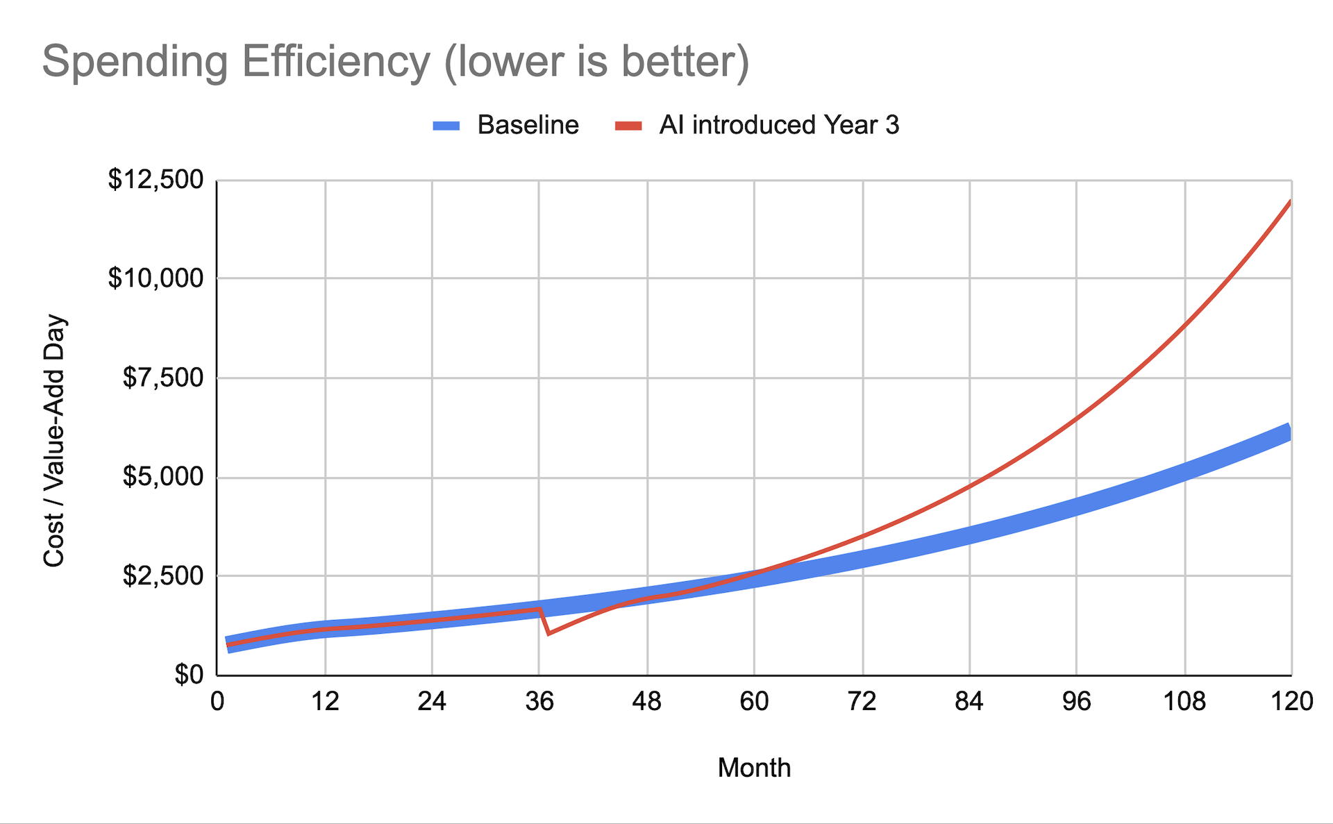
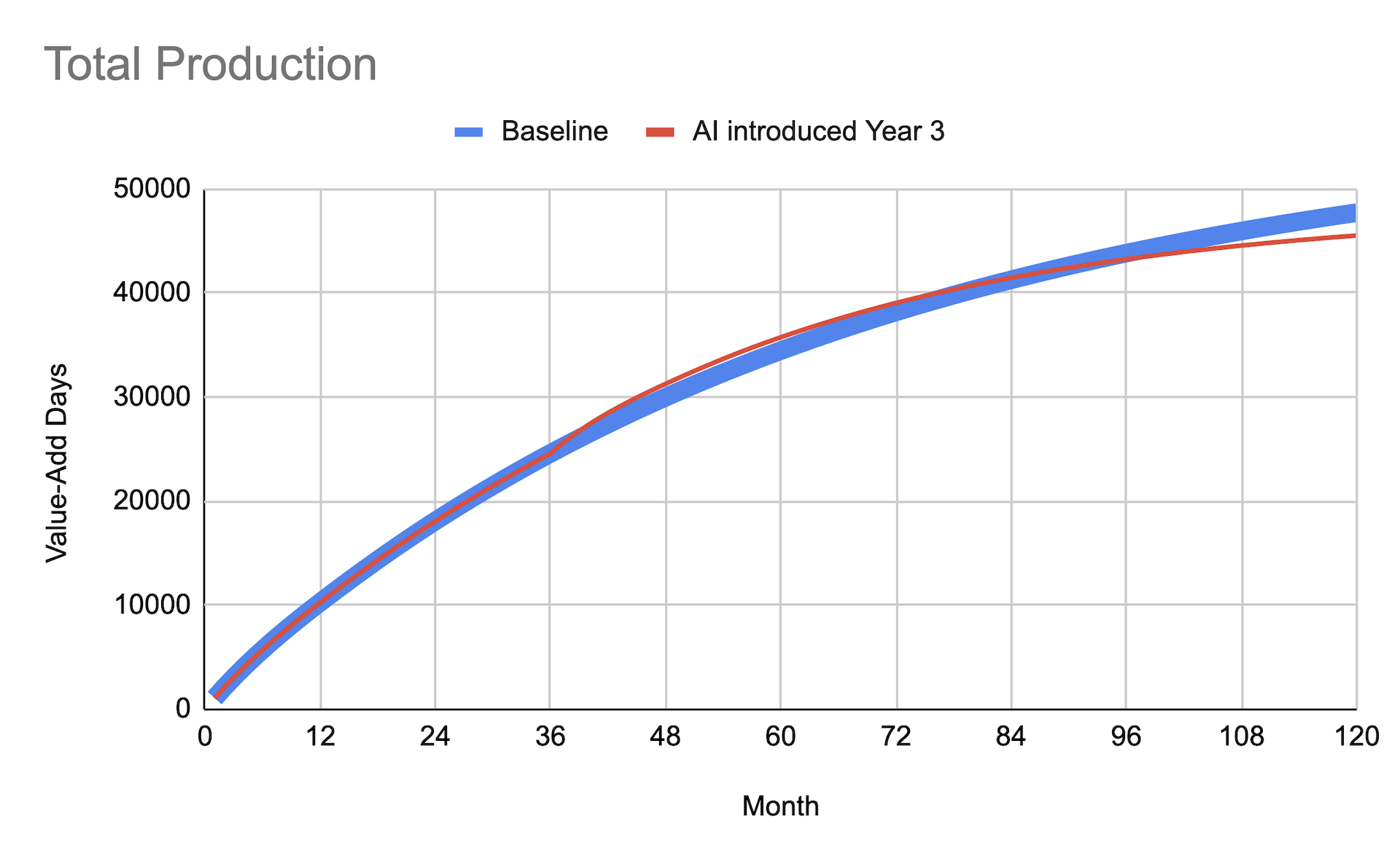
For example, using that model, if AI increases our speed by 50%, but token costs reduce headcount by 25% and maintenance costs are estimated to double, I can see that I’m only breaking even, despite the big performance improvement:
Excess Lines of Code
Lines of code aren’t a good productivity measure, but they are a reasonable cost measure. Generally speaking, more lines of code result in more maintenance costs.
This model works similarly to the previous one, but uses lines of code instead of engineering-days. Use traceability data to categorize commits as “value add” or “maintenance.” For each commit, measure gross code churn: the number of lines of code that were either changed, added, or deleted.
For each line of value-add change, estimate a certain amount of maintenance code churn in the following year, and then a lower amount in every year after that. Model how much maintenance code churn will be needed each month based on the value-add churn of previous months. (See the “tmux” tab of this spreadsheet for an example.)
To model AI’s impact, measure how AI affects code churn during your speed improvement trial. Then project value-add churn into the future and model how maintenance churn could change.
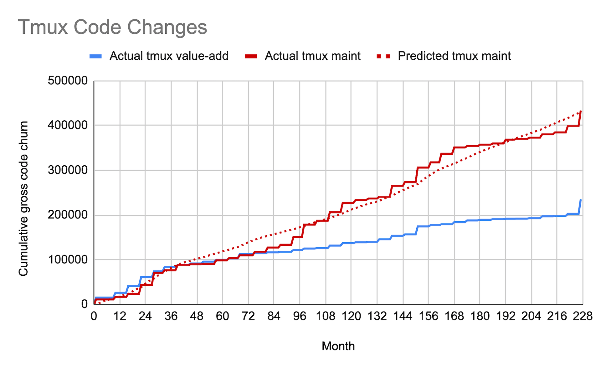
The advantage of this model is that you can use (part of) your actual commit data to refine your estimates. For example, the following graph uses real commit data from the open-source tmux project.2 Prior to running the model, I guessed one line of maintenance for every line of value-add in the first year, and 0.1 lines every year after that, which turned out to be a surprisingly close match to the actual data.
2Many thanks to Christophe Stjernlöf for providing the raw data from the tmux project. He used an LLM to classify commits as “value-add” or “maintenance.” The stairsteps are an artifact of the way the data was collected.
Lock-In
If token costs increase, how will you respond? Will you cut headcount? Reduce your use of AI? Switch to a less capable model?
To model these effects, update the “maintainability” model. Reduce your monthly engineering capacity according to headcount, and estimate reductions to your speed improvements based on AI reductions. You may want to add a separate set of estimates and calculations for humans maintaining AI-written code.
Burnout
AI Disclaimer: This image was created with OpenAI’s GPT-5.6 Sol model operating in “High” thinking mode.
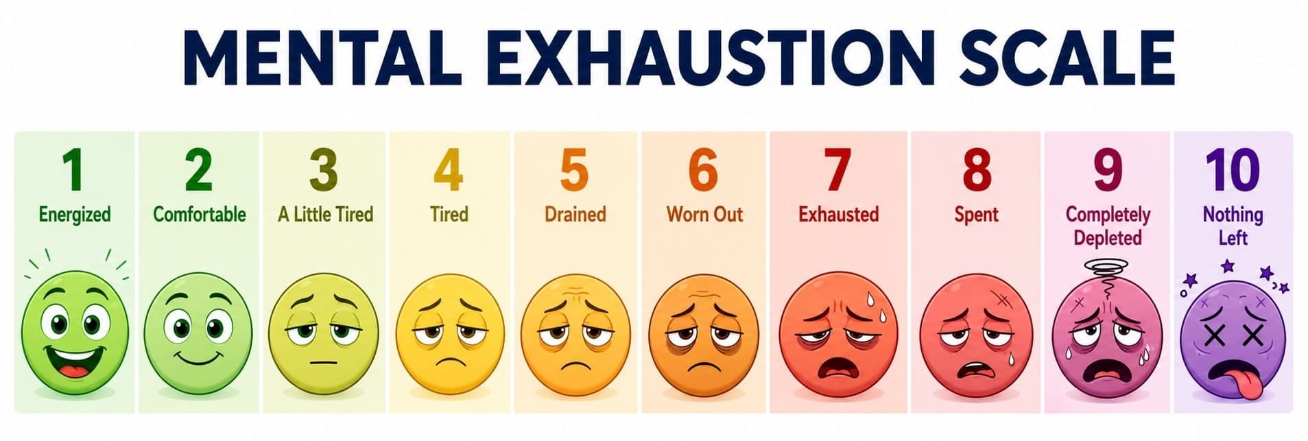
Productivity is likely to go down as mental exhaustion goes up, and turnover is likely to increase. I don’t think you can model these effects with any accuracy, but you can still keep an eye on them.
Include mental exhaustion as part of your development speed study to see if there’s a significant difference in mental exhaustion between the two approaches. Follow up with periodic one-question surveys about people's mental energy levels. Pay attention to actual turnover, relative to historical numbers, and look for complaints about AI in exit interviews.
And in the Darkness Bind Them
There’s a dark side to value-add percentage. It’s incredibly easy to game. As soon as managers think their teams are being judged based on how they categorize their work, the temptation to tweak the categorization in their favor will be exquisite.
It doesn’t even have to be fraudulent. A leader with prioritization authority and something to prove can simply decide to defer maintenance in favor of value-add work. The pressure to do so is already immense, and it takes unusually strong character to resist.
(If you really hate your company, consider this: You can get away with deferring maintenance for a couple of years. Just enough time to line up a bigger title at a different company! Then your successor is left holding the bag, and your old company wonders why product development can’t get anything done any more.)
I don’t have an easy answer to these problems, other than to remind you to use these metrics to evaluate your approach, not your people. There is no metric that can’t be gamed, and this one is more gameable than most. But it’s also critical for understanding AI’s possible downsides. Use it, but use it with caution.
Development speed and unintended consequences are two sides of the same coin. They help us understand how AI changes how much we deliver, both now and in the future. But just delivering more software isn’t enough. We need to produce the right software. We’ll look at business outcomes next week, in part 4.
To be notified when next week’s update comes out, add my feed to your RSS reader or subscribe to my free mailing list. Details here.